
In this episode of The Omni Show, Andrew is joined by Dr. Alyssa Goodman. Alyssa’s impressive resume includes titles such as: Robert Wheeler Willson professor of applied astronomy at Harvard, co-director for science at the Radcliffe Insitute for Advanced Study, and a Smithsonian Institution research associate. Throughout her career, Alyssa has explored how to share complex information with data visualization and computer simulations.
Alyssa’s interest in data visualization and astrophysics led to the creation of Glue, a multidisciplinary tool designed to help users explore relationships within and between the data sets often studied in astronomy and medicine. Drawing on her background in physics and astrophysics, Alyssa was inspired to figure out a way she could use data visualizations and computer simulations to address climate change—a novel approach in 2008. She soon saw the potential in using data visualizations for financial, global, and health simulations. At this time, most people had no idea what a computer simulation was—integrating data in this manner was not yet taught in schools.
For over a decade, Alyssa has worked to help others understand the value of computer simulations and data visualizations. Her dedication to this work has helped shape how both are now used as powerful forecasting tools to solve a myriad of complex problems. In 2009, Alyssa designed The Prediction Project, an initiative dedicated to explaining the value of modern predictions and helping others learn more about predictions through formal online courses.
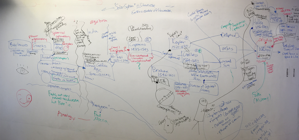
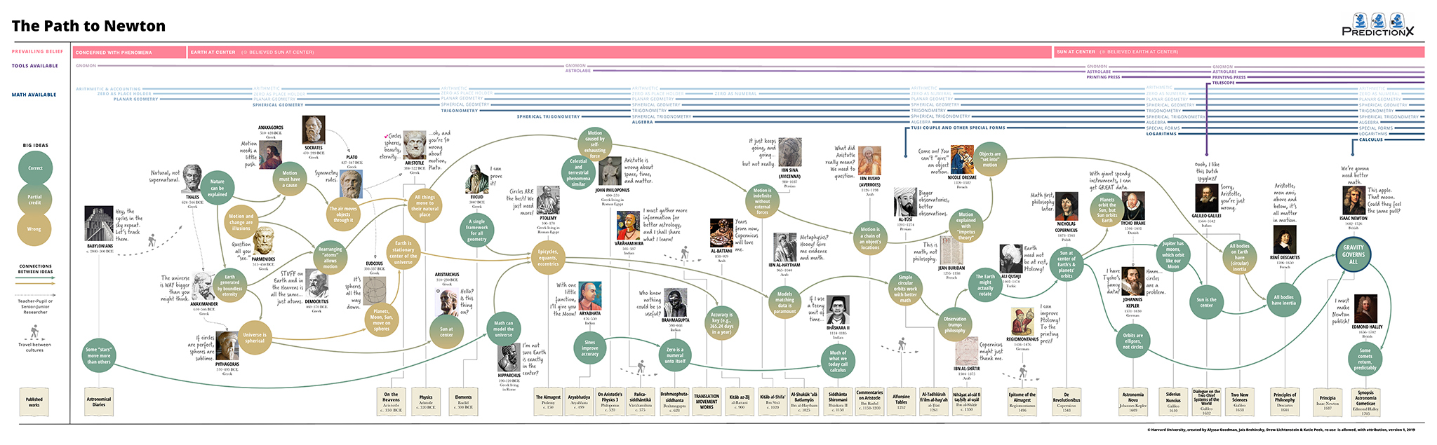
In today’s episode, Alyssa shares with Andrew how she used OmniGraffle to create her follow-up to The Prediction Project: the Path to Newton, an interactive visualization of the prevailing thought patterns and discoveries leading up to Sir Isaac Newton’s theory of gravity. Using tools like OmniGraffle and Tableau enables Alyssa to cross-section vast amounts of sophisticated information without merging the data. Her advice to others tackling data sets: “Learn how to use tools that let you integrate different data sets and have different views of them because you can learn much more from wide data than you can from big data.”
To learn more about Alyssa’s work—and how she uses OmniGraffle to filter, group, and map out complex data—tune in to The Omni Show. To create your own data visualization resources, download OmniGraffle for Mac. And if you have any questions or feedback, email support@omnigroup.com—our amazing Support Humans are standing by, ready to help.