By William Van Hecke and Curt Clifton
Version 2.3 of OmniFocus for Mac brings two new options for how to view your tasks and projects.
- Custom Columns is a new layout that puts data in a familiar grid, showing only the fields you choose — fields like project, due date, or estimated duration. This gives you the flexibility to show exactly as much information as you want.
- Title Folding is an option that reduces item titles to a single line, showing the full title when the item is selected. You can turn on folding to see more items at once and to preserve a regular vertical rhythm even when your titles are of varying lengths.
These options, which provide a scannable and information-dense layout that always shows precisely what you choose, join and complement the existing Fluid layout, which intelligently chooses which fields to display and prioritizes breathing room.
In this post we’d like to describe a bit of the design thinking behind the Custom Columns layout. We’ll follow up with a post that discusses how we added the feature to our existing code.
Before jumping into the design of Custom Columns layout, let’s revisit the key design goals of OmniFocus 2. OmniFocus 1 was a terrific app, but could sometimes feel more like a system construction kit than a system. One of the design goals for OmniFocus 2 was to make OmniFocus more approachable, which we addressed in several ways.
Simplified Perspectives
OmniFocus 1 had two view modes: Project mode showed your projects hierarchically and Context mode showed your tasks and projects in a flat list. Each of these modes had a variety of view options for what items to show and how to order them. A perspective, then, was just a way to save a set of choices for one or both view modes. This was a challenging mental model, since the view options felt very transient. The connection between a perspective and the displayed information was tenuous, and choosing a perspective could even change the options for the mode that you weren’t looking at.
For OmniFocus 2, we introduced a tabbed interface where each perspective corresponds to a single tab. A tab either shows project hierarchy or doesn’t, eliminating view modes as a separate concept. The view options for each perspective are available in a popover from within the tab. This provides a concrete connection between the options and what is displayed.
Built-in Perspectives
OmniFocus 1 came with a variety of pre-configured perspectives. But because you could configure them in all the same ways as custom perspectives, all the complexity of the OmniFocus 1 perspective system was exposed. You could edit the standard “Inbox” perspective until it had absolutely nothing to do with the Inbox at all. This opened up even more ways that people could get into confusing situations, with no escape hatch.
For OmniFocus 2, we gave our built-in perspectives a drastically simplified set of options. Each perspective offers only the options that really make sense for its intended purpose, and the options are labeled with explanatory text to set expectations properly. This approach let us introduce special perspectives like Forecast and Review, each designed for a specific use case and offering a unique handful of view options.
Standard and Pro Versions
OmniFocus 1 for Mac came in a single edition that included all the customization options.
In version 2, we offer OmniFocus as a standard edition plus a Pro upgrade. This lets us provide a cleaner, less complex, more affordable product for new users or those who don’t need advanced customization. The standard edition includes our built-in perspectives with the simplified options; these are meant to cover the majority of needs for the majority of people. If you choose to upgrade to Pro, you get (among other things) fully customizable perspectives. These provide custom sorting, filtering, grouping, and saved focus and selection, so you can build your own views to cover any specialized patterns of use beyond the standard perspectives.
Fluid Layout
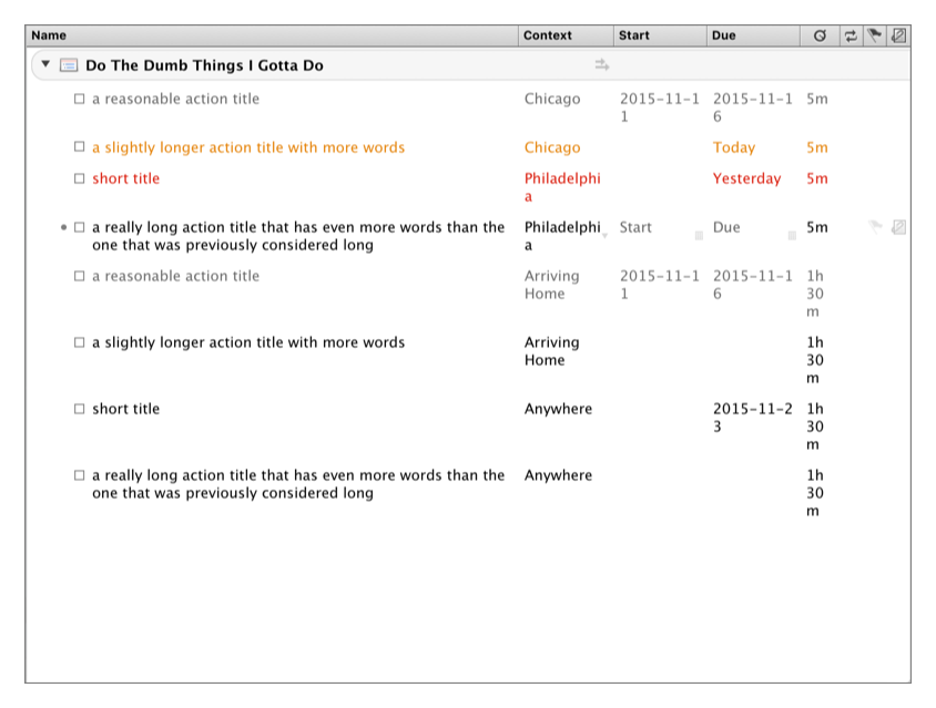
OmniFocus 1 laid out everything in a rigid grid of rows and columns. This had the benefit of being predictable and scannable in two dimensions, but it also felt severely constrained on the horizontal axis, often causing text to wrap in awkward ways and putting the burden on you to manually fight the battle of column widths versus window width. It also made for a layout with lots of “holes” in it, where there didn’t happen to be a value set for a given column but we needed to reserve a place for it anyway.
 When you have to manage column widths yourself, you can end up with awkward wrapping and ugly holes in your layout.
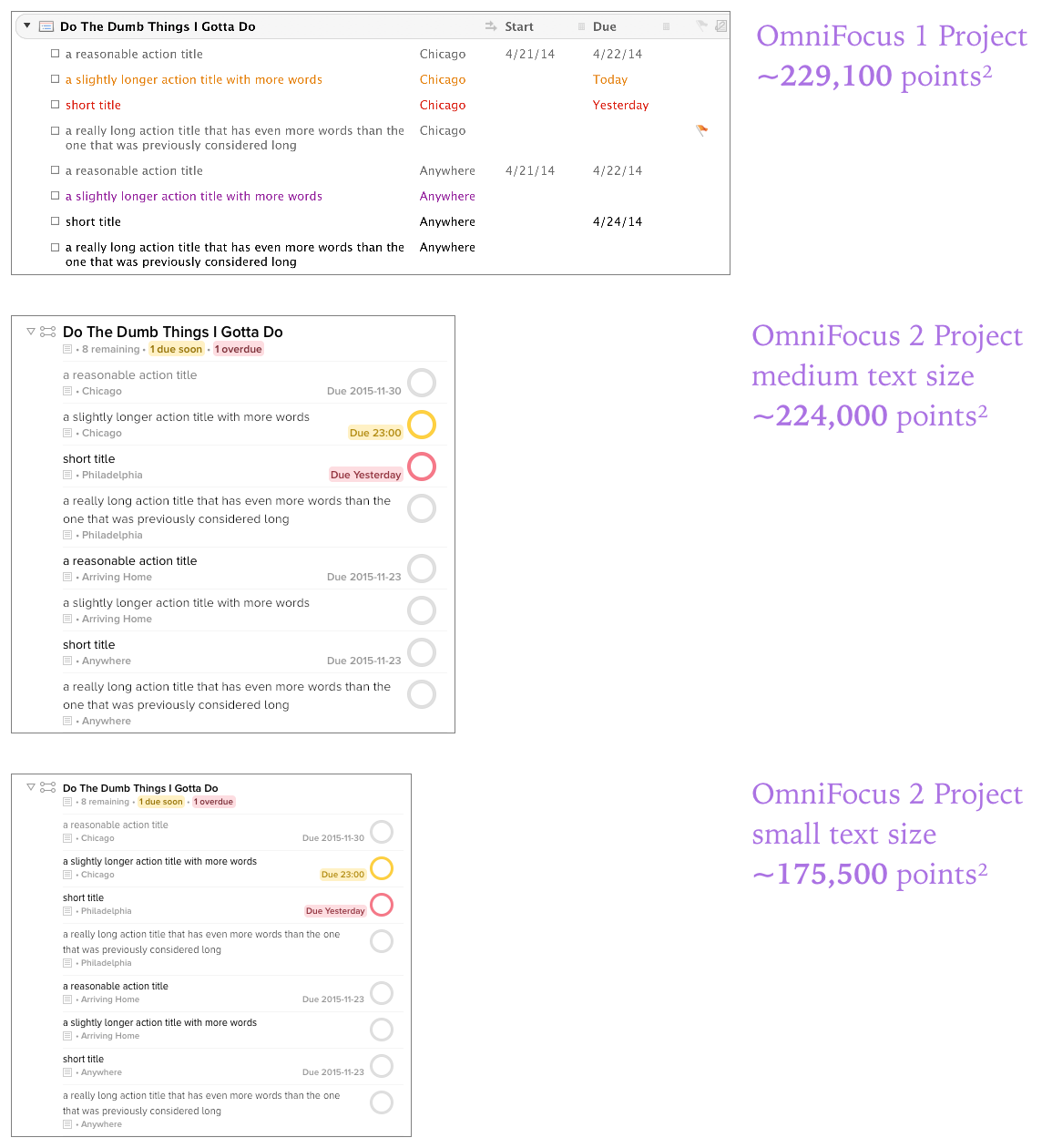
For version 2, we switched to a fluid layout that places more emphasis on titles. Long titles can span the entire width of a row, followed by a deemphasized second line of metadata much like in a standard iOS table view. OmniFocus saves space by intelligently choosing which fields to show based on which fields are relevant for each item and how much space is available. At rest, the metadata fields stay as quiet as possible. But when you put the mouse pointer over a row or start editing it, they become more apparent so you can interact with them. For containers (like projects and contexts), we use the metadata row to show a summary of the items inside and how many of them are due.
This all means that there’s much less pressure on you to figure out a good window layout — the app does that work, offering a much larger range of window geometries that result in something reasonable without any extra setup. It also uses vertical space more aggressively than horizontal space, since scrolling vertically is a cheap interaction and scrolling horizontally is awkward and best avoided.
 OmniFocus 2 Fluid is more space-efficient than OmniFocus 1 if you use a narrow window.
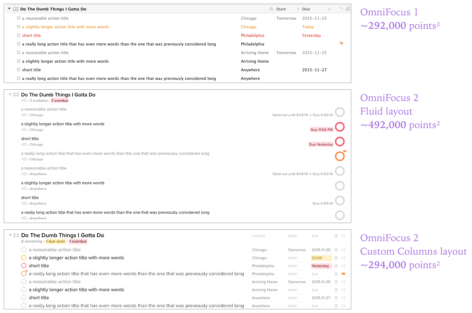
 With wide windows, the Fluid layout is less dense. The new Custom Columns layout makes more efficient use of the width, with plenty of room for any extra columns you may care to add.
Adding Custom Columns to OmniFocus 2
All that worked great for a majority of OmniFocus use cases, which was a relief. When software takes configuration control away from the user and makes the computer do it, the result can be either liberating (“Yay, I don’t have to worry about this anymore!”) or irritating (“Ugh, now instead of letting me make smart decisions, the computer is making dumb decisions on my behalf”). Happily, the feedback on OmniFocus 2 has been overwhelmingly positive; we seem to have made it smart enough to handle most people’s needs gracefully!
But just because we’d made the app more approachable and more sensible without too much setup, we still wanted to do well by our customers who want more control. We identified some common themes in what else our customers wanted to be possible in the layout.
- More vertical compactness, so that short windows can show more items without scrolling.
- A better use of the very wide space afforded when you take OmniFocus full-screen on a big display.
- The ability to choose which metadata fields appear.
- More stable positions for metadata fields between rows, to improve “scannability” when comparing different rows’ contexts, duration, or other values.
On the surface, the solution might seem to be to just bring back OmniFocus 1’s spreadsheetesque layout. But we believed we could design for these needs while holding on to OmniFocus 2’s hard-earned improvements in approachability. The result of this quest for balance is the new Custom Columns layout. Superficially, it looks a bit like OmniFocus 1, but Custom Columns have a lot more intelligence behind the scenes.
- OmniFocus automatically chooses the width for each column. (This sounds trivial but it took quite a lot of thinking and tuning to arrive at a scheme that works.) Some columns are fixed width; date columns for instance are set to be as wide as the widest possible date given your OS X date format, always resulting in a reasonable size with no wrapping. Other columns, like Project and Context, resize proportionally with the width of your window while obeying sensible minimum and maximum widths. All this means we can omit the visual noise and the invitation to fidget that come with column headers.
- Indentation of grouped items borrows space from the title column until the titles reach a minimum width. Beyond that, we start omitting columns from left to right so that the remaining columns stay aligned.
- In Custom Columns layout the selected columns appear in a fixed order. This is one of the more obvious tradeoffs in the design. It would certainly be possible to allow rearranging them, but we thought that the benefits were outweighed by the cognitive burden of multiplying everything in the Custom Columns interface by another dimension of complexity.
- The existing Text Size setting in OmniFocus preferences is even smarter with Custom Columns, employing carefully-tuned reductions in negative space and smaller status circles when you choose smaller text sizes. This allows for maximal information density without spawning another setting.
- For the standard edition, your layout is a single app-wide choice made in OmniFocus Preferences: use our recommended Fluid layout everywhere, or use the Custom Columns of your choice everywhere. The main interface of the app doesn’t force you to choose a layout or encourage you to flip back and forth.
- If you have the Pro upgrade, the same app-wide preference applies by default, but you gain the ability to customize the layout on a per-perspective basis. As for other perspective settings, it all happens in the the view options popover. Using an app-wide default makes layout a “set it and forget it” choice for most perspectives. On the other hand, being able to choose different metadata for different perspectives opens up tons of possibilities. For example, in Quick Entry, Curt chooses to show just the item title and due date to encourage him to capture items as quickly as possible.
Custom Columns Layout in OmniFocus for Mac is our approach to introducing more flexible layouts and preserving the friendliness of the interface. The technology behind it is sophisticated (as you’ll see in the next post) but ideally, the user should be able to ignore it and get to work. Based on feedback from people in our public test phase and since our launch, we think we’ve struck a useful balance.
In our next post, we’ll discuss how we implemented this design in our existing app.
