If you read our tagline, you might think that OmniGraphSketcher is all about “fast, simple graph drawing and data plotting.”
Which is true.
But why did we make such a program? (Or if you like puns, what's the “point”?) Why does it keep us up at night, and how do we decide which features should be improved first? In short, I want to tell you about our vision.
The first part of the vision has to do with quantitative ideas. Quantitative means that scale is relevant. It means it's valid to say that one thing is twice as big, far, tall, fast, costly, or experienced as another. Quantitative ideas are central to scientific disciplines and an important part of most business and policy issues. Thinking quantitatively allows us to understand and predict how different parts of the world relate to each other in a precise manner. How will higher taxes affect the local economy? How will this ratio of chemicals change the battery's charging time? How does this bridge react to increasingly larger loads?
I emphasize ideas because quantitative knowledge is not limited to what traditional software tools have focused on: numerical data and equations. Sometimes knowledge is less specific. For example, you might just have a rough idea of how different price points affect the number of sales. Or you might know how a new material behaves at room temperature but have only an intuition about what happens above 100 degrees. These quantitative ideas could be a precursor to a more precise theory, or they could be as precise as they need to be, given the messiness of the real world.
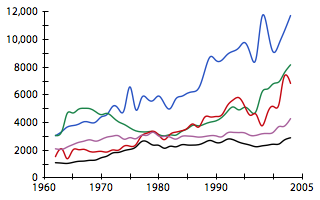
The second part of the vision is communicating those ideas visually. That's because often, the best way to explain a quantitative idea is through a picture. This is true whether you have data, equations, or imprecise quantitative notions. Would you rather have a table with 240 numbers, or a visual plot of that data?
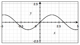
Is it more meaningful to specify f(x) = sine(x), or to see that function in the x-y plane?
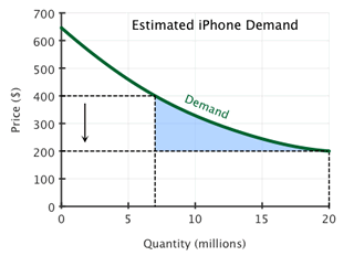
And finally, is it more informative to talk generally about the relationship between quantity and price of a product, or to see an illustration of how the price affects the quantity demanded?
Of course, words, equations, and tables of numbers are useful too. But particularly when you're trying to communicate ideas to someone else, there's a good chance that a visual will make it easier to understand.
Communication does not just mean throwing information at someone; it means transferring real understanding in a reasonably short amount of time. For this to happen, the receiver needs to get the information on a logistical level – say, a piece of paper or an emailed PDF. Then they need to get it on a perceptual level – for example, notice that one data point is above another or that two data series intersect in a certain place. And finally, they need to translate those visual inputs into something meaningful – say, that the market share of one product is overtaking another.
For successful communication to happen, all three of these levels must be met. To facilitate the logistics, we try to provide easy ways to export and share your graphs. To improve accuracy in perception, we use our knowledge of the human visual system to define and encourage best practices for information layout. And to help make the visuals meaningful, we made it easy for you to annotate your diagrams in a variety of ways.
In summary, the vision of OmniGraphSketcher is to make it as easy as possible to visually communicate your quantitative ideas.
Hopefully, this gives you some hints about how we might expand the functionality of OGS in the future (though we can't make any guarantees). For example, logarithmic scales and date/time scales are high on our priority list since many quantitative ideas are best expressed in those contexts. We'd also love to improve your ability to annotate graphs by allowing equations or other pictures to be dragged onto the canvas. (For now, you can only do this by exporting your graph to another program.)
This should also provide hints about where we're not headed. For example, although pie charts are considered standard in some applications, they use a large amount of space, display a small amount of data, and are not well suited to the human visual system. In other words, we don't think they have any visual communication advantages over bar charts, which we already include (more on this in a future post). Another “standard” feature that we omit on purpose is the legend-in-a-box. It's much easier to read a graph that puts each label right next to the data it refers to, and we designed OGS to make this easy.
As always, we look forward to your feedback. We're most interested in the motivations behind requests – for example, “labeling lines” rather than “rotating text”. And when possible, attach an example graph or diagram – since we so love visual communication.