Software design is pretty much dead-center between being an art and a science. Or as Jobs said, at the “intersection of technology and liberal arts”. This means that while some decisions we have to make are logical and can be satisfyingly backed up with evidence, other decisions are thrillingly, maddeningly subjective matters of taste.
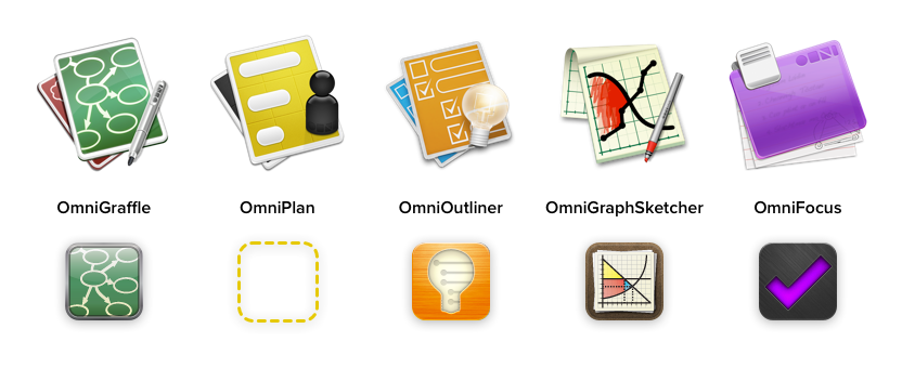
So… App icons! They’re way over on the subjective side, and are at least as much marketing as they are user interface. Over the years, we have taken a few different stabs at developing a distinctive style for our app icons, but the realities of shipping software made it so that we were never really poised to release a major upgrade to everything all at once. So instead we made staggered incremental changes across our suite of apps, making for this diverse crowd.
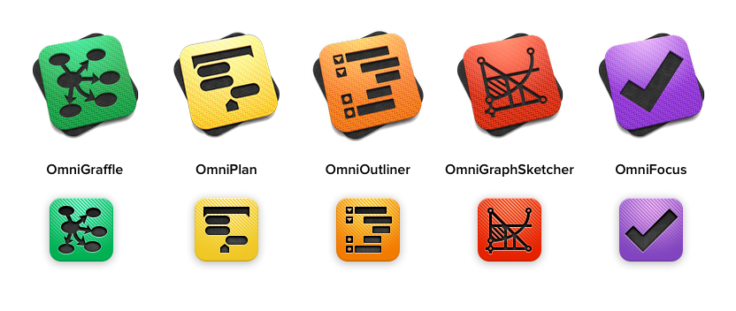
But during the course of pursuing our iPad or Bust initiative, we decided that we would never have a better time to make our app icons more consistent. Better to change all the icons at once than to wait for each of our five huge productivity apps (spread across three platforms) to reach major versions, updating the icons one by one. So we got to work on coming up with a consistent style. Here’s the final result:
This new suite of icons emerged from an extensive list of demands:
Each product should have a distinctive emblem with a strong contour. The emblems are simple figure/ground shapes. They don’t depend on colors, gradients, shadows, or other effects, so we can use them in a variety of treatments: flat logos, outlines, cut-outs, and so on. Joel forged these emblems in OmniGraffle as purely positive/negative-space shapes.
Each product should have a consistent look across platforms. The emblems and theme colors identify the products from Mac to iPad to iPhone. (Relying primarily on color would cause problems for folks who perceive color differently!)
Each platform should have a consistent look across products. iOS apps get a colored slab with the emblem cut out, showing the black slab beneath (or white, for our iPhone app). The Mac variants are the same, but with the slabs rotated and tilted slightly away from the viewer. We go way back on Mac OS; that composition is a bit of a callback to the classic angled-document app icon style.
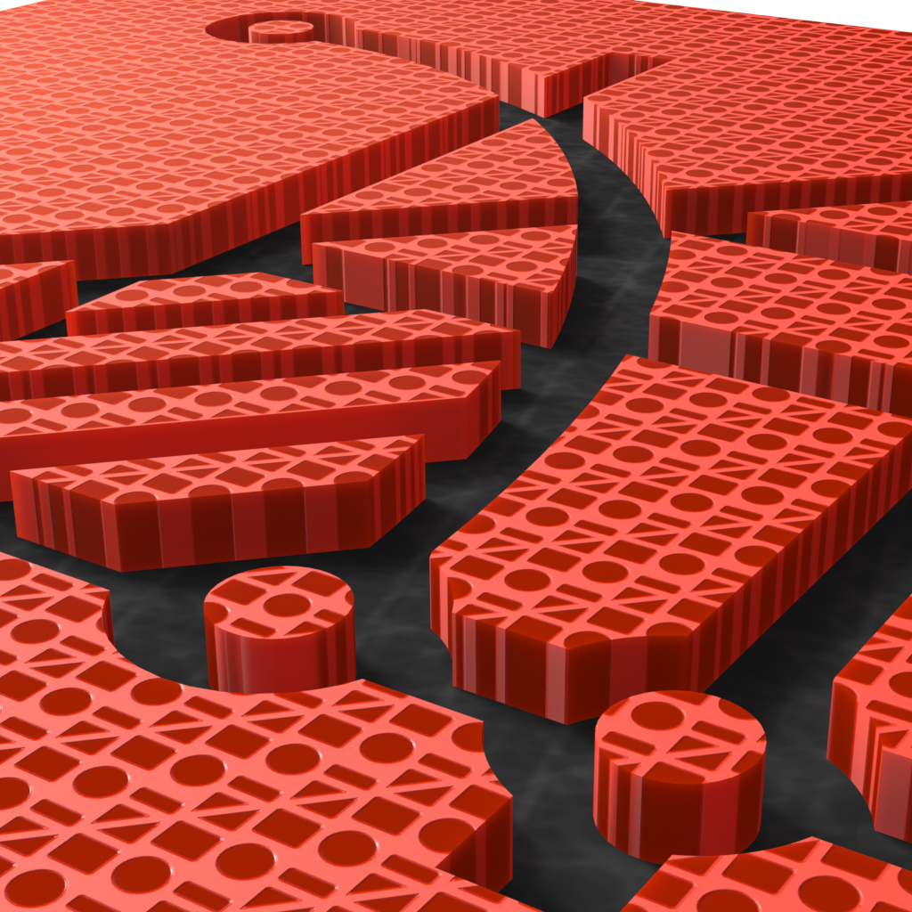
The icons should have a sense of being part of a unified set. This was a big one, and it took a while to get right. We didn’t just want them to look unified, we wanted them to look unquestionably Omni — we don’t have it as bad as Panic, but our icons have been stolen from time to time. It was hard to think of how to do this other than slapping a huge Omni logo on each icon. So instead, Joel had the idea of slapping hundreds of tiny Omni logos on each one. In doing so, we were even able to evoke our old brushed-metal motif.
The colored front slabs bear a carbon-fiberesque pattern of Omni logos, and the back slabs bear a prime-number-based marble pattern of Omni logos:
Lots of people here at Omni put a ton of work into this project, but Joel was the main dude. Many cheers for Joel! I did the final art for the iOS variants in Photoshop, and for the Mac variants in Modo. I’ll leave you with a shot of the OmniGraphSketcher icon from when I was zoomed in to scrutinize some tiny detail; Joel looked over my shoulder and immediately declared, “Oooh, I wanna play an FPS in there!”