As I'm sure many readers of this blog are aware, there is this fine fellow named Edward Tufte who is somewhat of a guru in the field of information visualization. And if you're at all familiar with his work, then you've seen his favorite graphic of all time, the Charles Minard poster of Napoleon's march on Moscow in 1812: 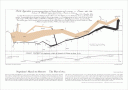
From Tufte's website, here is his description of this graphic:
Probably the best statistical graphic ever drawn, this map by Charles Joseph Minard portrays the losses suffered by Napoleon's army in the Russian campaign of 1812. Beginning at the Polish-Russian border, the thick band shows the size of the army at each position. The path of Napoleon's retreat from Moscow in the bitterly cold winter is depicted by the dark lower band, which is tied to temperature and time scales.
Well, since I wanted to play around with OmniPlan, I figured I'd recreate this famous graphic. The result is thusly:
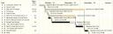
I took some very liberal liberties in adapting this historical data to OmniPlan, but I think that it turned out pretty well. Mainly, the completion of a task is used to show much of the army is dead.
This was sparked by the conversation on Tufte's website about Project Management Graphics (or Gantt Charts), and specifically by the poster near the bottom who was looking to format his gantt chart, but was running into issues using the program he had.
Feedback is very welcome, as I'd love to explore new ideas in presenting information using OmniPlan. I'd also love other data sets to adapt using OmniPlan, so feel free to suggest anything you might think is cool.