Hallo, friends. To commemorate the big OmniFocus 1.8 update, with its bounty of interface improvements, I invite you to look back at the history of the OmniFocus interface.
The first publicly revealed image of the OmniFocus interface was this OmniGraffle mockup, from an event at the San Francisco Apple Store during Macworld 2007. I suppose I could post an actual screenshot, but I’ve always been proud to have something I worked on appear in a blurry photograph on a Mac rumors site, as if it was of some sort of top-secret Apple project.
Almost precisely one year later, OmniFocus 1.0 was released. I’ll be the first to admit that version 1.0 was a… utilitarian design. We maintained that all the first step needed to be was a proper Cocoa implementation of the AppleScript & OmniOutliner system, Kinkless GTD. Of course, we couldn’t help adding luxuries, but for the most part we were excited to get something useful out to people. Then, once it was out there, we wanted to hurry up and fix the flaws. So despite all their usefulness and charm, the early versions of OmniFocus did not have the benefit of comprehensive, contemplative design review.
Let’s look at OmniFocus 1.0 (actually 1.0.3, as that’s the earliest I could unearth) and see how it compares to version 1.8.
First Run
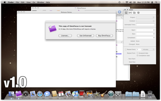
OmniFocus 1.0 had a rather unwelcoming first-run experience: an “unlicensed” message, a big white window that eventually loaded a waterfall of release notes, a disabled inspector of empty controls, and a sliver of the main window peeking through. Wh— why!? Well, after the public sneaky peek process, version 1.0 was, for almost everyone involved, just another build. Not paying enough attention to how it felt to use OmniFocus for the first time was our main oversight.
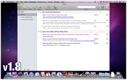
OmniFocus 1.8, though, starts out with nothing more than a normal window containing some sample projects, ready for you to get started. We're trying to recognize that you downloaded the app because you want to try it; there will be plenty of time for the rest of that stuff later. The trial notice sits politely in the upper corner of the window, ready to talk about licensing when you are. This lovely idea, now common in Mac software, originated in Coda.
General Typography and Layout
Your highfalutin literary quotation for today is Si latet, ars prodest — When the art is concealed, it succeeds. Ovid wrote that, around the year -1. And, uh, he was actually writing about how to impress a lady. But it’s just as true of typography and UI design: When someone has fretted over the tiny details of where and how your information is presented, the presentation becomes transparent and you see through it to the content. When the details are wrong, you get a sense that something is awry, even if you can’t pinpoint what; your stuff is there, but behind smudged glass in a crooked frame.
I’ll pick out a few of the improvements we’ve made since version 1.0 to give your data the presentation it deserves.
The most immediately refreshing change was switching the font from 12-point Helvetica to 13-point Lucida Grande. Apple’s Human Interface Guidelines recommend Lucida Grande as a default font for user content, because its wide apertures and distinct letterforms make for excellent readability on screens. Lots of applications, though (including Apple’s TextEdit and Mail) use Helvetica, presumably because it includes an oblique variant, which people expect when editing rich text. On iPhone, Helvetica seems to work well, possibly because of the higher DPI allowing for higher point sizes, and the tendency of the device to be closer to a reader’s eyes. For plain text on a Mac screen, though, Lucida Grande feels lighter and more spacious.
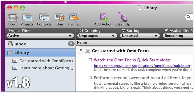
Giving each row more breathing space also made a big difference. It cost us a bit of information density, so your window needs to be bigger to accommodate the same stuff. But the way items feel more discrete and more individually substantial is worth it. Now each item is given plenty of space, making it a comfortable click target. But the space furnished to each item also acknowledges that it’s a thing that you have deemed meaningful enough to put in our application, not just another row crammed into a list.
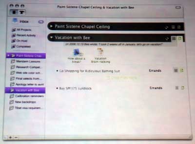
We’ve nudged almost everything at least a pixel or two for better alignment. We cleaned up and encrispened all of the item icons, especially the little index cards that represent projects and contexts. What were once tiny boxes buzzing with high-contrast 1+1=3 effects have quieted down. No icons are rescaled from their original sizes into fuzzy mush anymore. (The new item icons are actually from when the nice folks at Bee Docs requested some graphics for their OmniFocus integration, and I was embarrassed to send the ones we had. So I went ahead and made the improvements I’d been meaning to make for a while.)

Filtering: Where Did My Data Go?
At first, one of our main goals was to facilitate personally customizable view settings, especially for hiding everything you don’t need to see right now. You know, so you can focus on your work. That quest for flexibility gave us the View Bar, Perspectives, Planning and Context modes, and a detailed item status system. You can demand Only show me items due today that are for this client and contain the word “web”, sorted by when I created them and grouped by context.
That was great. You could set up all sorts of precise searches, hiding unimportant items willy nilly. But the burden of governing all that power was on you. We neglected to include obvious, helpful built-in view settings with buttons you can mash to get back to a sensible state, and instead invited people to set up and manage their own Perspectives. Early-adopting power users were happy to take advantage of the view options, while casual or beginning users didn’t know where to begin or how to get back to seeing all of their stuff.
For version 1.5, part of clarifying what is going on with your view was simply increasing the visual substance of the View Bar, and labeling its many pop-up menus. For a while, we colored any setting that was different from the default. But it became unclear what “default” means, and whether we ought to be bothering people who preferred to keep slightly different settings from our recommended ones.
More importantly, we added several built-in perspectives to the default toolbar, for getting back to reliable view settings no matter where you are: Inbox, Projects, Contexts, Due, Flagged, and Review. These relieved the need for almost everyone to create the same basic perspectives. We knew that most people would want something like these views, so why not provide them in the first place? And if you want something slightly different, the rebuilt Perspectives interface makes it straightforward to adjust them or create your own.
Onward
Of course, all of these improvements, and the cornucopia of improvements I haven’t mentioned, have been tempered by needing to avoid changing the architecture or character of the app too drastically. So the really exciting new work is going into OmniFocus 2, the design of which is turning out to be a vanguard for the future of Omni Mac apps. I can't tell you anything about it yet, of course, but the designs we've come up with make me want to graduate from version 1 as soon as possible.
Meanwhile, the tremendously positive response to OmniFocus for iPad has made us revisit our assumptions about Mac software. The marriage of our existing OmniFocus 2 plans and the philosophy of OmniFocus for iPad gives this app a pretty dang bright future.
If you’ve been using OmniFocus all along, and especially if you’ve let us know what you think of it, thank you for your lasting support. If you’ve started using OmniFocus lately, thank you for checking us out. If you aren’t using OmniFocus, well… thanks for reading this super long blog post anyway!